
Before You Start Browsing
Pinterest boards full of gorgeous label mockups are easy to find and mostly useless without context. A stunning wine label concept means nothing if you’re launching a hot sauce brand on a tight print budget. The right label design idea always depends on what you’re actually selling, who’s buying it, and where it’ll sit once it’s on a shelf or a doorstep.
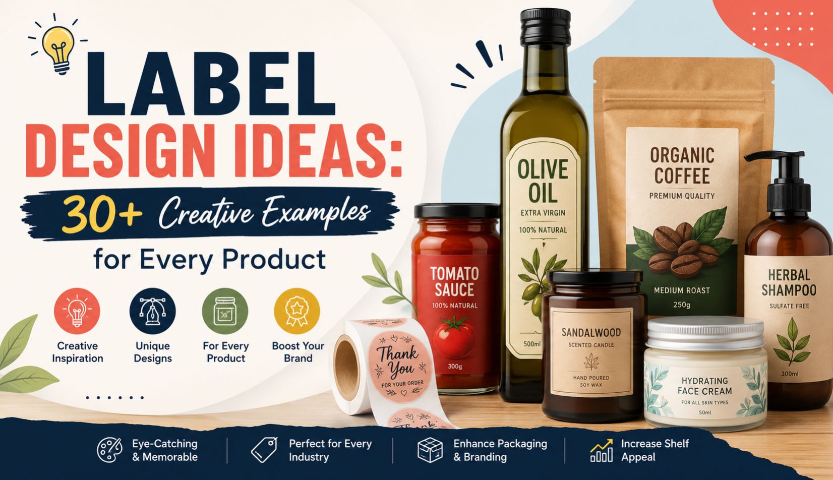
This roundup pulls together over 30 label design ideas across food, beverages, cosmetics, supplements, and lifestyle goods, organized by category instead of just thrown together as a random gallery. Each idea comes with a note on when it actually works, since half the value in a list like this is knowing when not to use something.
If you already know your product category, jump straight to that section. If you’re still figuring out direction, the cross-category trends section near the end is worth reading first.
Design Note: save three or four ideas that genuinely fit your product, not the ten that just look cool. Chasing too many directions at once is how most first-draft labels end up feeling scattered.
Why a List of Ideas Isn’t Enough on Its Own
A good label design idea only works when it’s paired with the right material, the right print process, and an honest read of what your specific shelf or category actually looks like right now. Copying a beautiful label style without checking those three things usually ends in a reprint.
Take embossing, for example. It looks fantastic on a premium skincare label. Apply the same idea to a small-batch hot sauce that gets handled constantly by sticky fingers at a farmers market, and it wears down fast, sometimes within weeks.
That’s really the whole point of browsing ideas properly. Not just “does this look nice” but “does this actually survive contact with my product, my customer, and my price point.”
A short gut-check worth running on any idea you like:
- Does the material this idea needs match how your product gets stored and handled?
- Is the printing method (foil, embossing, digital, offset) realistic for your production volume?
- Does the idea still work at your actual price point, or does it read as trying too hard?
- Have you seen this exact idea already used heavily by direct competitors?
Watch For: an idea that looks perfect on a mockup site but has clearly been used by fifty other small brands this year. Pinterest boards recycle trends fast, and originality fades quickly once something starts trending.
8 Label Design Ideas for Food Products
Food labels have to do a specific kind of persuasion work, since appetite and trust both need to land within a second or two of a shopper glancing at the shelf.
1. Hand-illustrated ingredient icons. Small line drawings of key ingredients, a chili, an olive, a grain of rice, placed near the product name. Works well for sauces, spice blends, and pantry staples leaning into an artisanal feel.
2. Kraft paper with a single accent color. Natural brown kraft stock paired with one bold ink color keeps costs down while still looking intentional. Common for organic snack brands and small-batch bakeries.
3. Vintage recipe card style. Typewriter-style fonts, aged paper texture, a slightly imperfect layout meant to look handwritten. Suits heritage or family-recipe brands with a genuine story behind the product.
4. Bold color blocking with high-contrast type. Bright, saturated backgrounds with clean sans-serif text. Works especially well for snack brands competing for attention in a busy convenience store aisle.
5. Window-cut labels showing the product. A die-cut opening in the label lets the actual food peek through. Effective for baked goods, granola, and anything where the product itself looks appetizing.
6. Minimalist nutrition-forward layout. Front-of-pack calorie or macro information given equal visual weight to the brand name. Popular with health-focused snack brands targeting a fitness-conscious buyer.
7. Regional pattern or textile-inspired borders. Traditional print patterns adapted into a modern label border, useful for brands leaning into a specific regional or cultural food identity.
8. Chalkboard or market-stall aesthetic. White or colored text mimicking chalk lettering on a dark background. Suits fresh, farm-to-table positioned products, sauces, jams, and small-batch condiments especially.
Related reading: Food Label Printing and FMCG Label Manufacturer in Jaipur go deeper into material choices for these food-specific ideas.
6 Label Design Ideas for Beverages
Beverage labels have to survive condensation and rough handling while still standing out fast, since drink purchases tend to be impulsive.
9. Full-wrap shrink sleeves with bold graphics. Covers the entire bottle or can, giving room for illustration-heavy or story-driven designs that a small front label simply can’t fit.
10. Metallic foil accents on dark backgrounds. Deep colors like navy or black with gold or silver foil detailing. Common for premium sodas, craft mixers, and boutique bottled water lines.
11. Hand-lettered brand names. A custom, slightly imperfect script or lettering style that feels personal rather than mass-produced. Works well for small-batch juices and craft beverages.
12. Retro soda fountain styling. Bold circular badges, vintage color palettes, playful typography borrowed from mid-century advertising. Suits craft sodas and nostalgia-driven beverage brands.
13. Clear label with minimal print. Just a small logo and required text, letting the drink’s own color show through the bottle. Effective for cold-pressed juices where the product color itself is the visual draw.
14. Ingredient-forward illustrated labels. Fruits, herbs, or botanicals illustrated directly around the label, common for flavored waters, kombucha, and botanical mixers leaning into a natural positioning.
Design Note: any beverage label idea involving paper stock needs a waterproof or laminated finish if the product ever sees a fridge. Skipping that step is one of the more common, and expensive, mistakes in this category.
6 Label Design Ideas for Cosmetics and Skincare
Cosmetic label design ideas usually need to signal quality fast, since buyers associate visual polish directly with product efficacy, fairly or not.
15. Matte finish with embossed logo. A soft-touch matte label with a raised, embossed brand mark. Reads as premium without needing bright colors or busy graphics to do the work.
16. Apothecary-style typographic labels. Dense, precise typography reminiscent of old pharmacy bottles. Works well for skincare brands positioning around active ingredients and clinical credibility.
17. Pastel gradient backgrounds. Soft, blended color transitions, popular in the clean beauty and Gen Z-targeted skincare space right now.
18. Botanical illustration overlays. Delicate line drawings of the actual plant or botanical ingredient used in the formula, layered subtly behind the product name.
19. Transparent labels on tinted glass. Minimal printed text on a clear label, allowing a tinted amber or blue glass bottle to carry most of the visual weight.
20. Bold, oversized single-word branding. One dominant word or short phrase taking up most of the front label, with supporting details pushed to a smaller back label. Common in newer, disruptor-style beauty brands.
Related reading: Cosmetic Label Manufacturers and Perfume Bottle Label Manufacturers cover material specifics for several of these finishes.
5 Label Design Ideas for Health and Supplement Products
This category has to balance persuasive design with strict accuracy, since supplement labels face heavier scrutiny than most other product types.
21. Clinical minimalism with certification badges. Clean white backgrounds, a single accent color, and visible third-party certification marks placed prominently rather than tucked away.
22. Color-coded product lines. Each variant (say, different vitamins or flavors) uses the same layout with a different accent color, helping customers navigate a larger product range at a glance.
23. Infographic-style dosage information. Simple icons or a small visual chart showing dosage timing or benefits, instead of relying purely on dense paragraph text.
24. Earth-tone, nature-referencing palettes. Muted greens and browns paired with clean typography, suited to herbal or ayurvedic supplement lines. See Ayurvedic Medicine Label Printing for related material guidance.
25. Athlete or performance-oriented bold branding. Sharp angular graphics and high-contrast colors, common for sports nutrition and performance supplement brands targeting a younger, fitness-focused buyer.
Watch For: over-designing a supplement label to the point where required dosage or certification information becomes hard to find. In this category specifically, clarity has to win over style whenever the two conflict.
5 Label Design Ideas for Candles, Home, and Lifestyle Goods
Home and lifestyle products get more creative freedom than food or health categories, since there’s less regulatory text competing for space.
26. Textured, tactile paper stock. Cotton or linen-finish paper that feels different in hand, reinforcing a premium, artisanal positioning before a customer even reads anything on it.
27. Wraparound storytelling labels. A longer label that wraps most of the way around the container, using the extra space to tell a short brand or ingredient story rather than just listing facts.
28. Monochrome with a single pop of color. Black and white base design with one small colored element, a dot, an underline, a small icon, drawing the eye without overwhelming the layout.
29. Seasonal or limited-edition variant labels. A core label design that gets a seasonal color or pattern swap, useful for candle and home fragrance brands running limited drops throughout the year.
30. Hand-stamped or wax-seal inspired detailing. Small design elements that mimic a wax seal or hand stamp, adding a artisanal, slightly imperfect touch to an otherwise clean layout.
31. Exposed rivet or tag-style attachment. Labels designed to look like a hang tag rather than a wraparound sticker, often used on candle jars and home fragrance bottles for a boutique retail feel.
Cross-Category Trends Worth Knowing About
A few directions are showing up across almost every product category right now, regardless of what’s actually being sold.
- Sustainability cues, recycled paper texture, muted earth tones, visible “recyclable” messaging, are appearing well outside just eco-focused brands
- Bold, oversized typography with minimal supporting graphics continues to spread from beauty into food and beverage categories
- QR codes are getting worked into the actual design rather than just tacked onto a corner as an afterthought
- Matte finishes are edging out glossy ones across nearly every category chasing a premium feel
Takeaway: trends move fast, but they don’t automatically fit every product. Borrow the underlying idea (say, sustainability messaging) and adapt it, rather than copying the exact visual treatment a totally different category is using.
Turning an Idea Into an Actual Printable Label
Liking an idea is the easy part. Getting it onto an actual bottle, jar, or box that survives shipping, handling, and a few months on a shelf is where most of the real work happens.
A practical way to move from inspiration to a finished file:
- Shortlist two or three ideas that genuinely fit your product and budget
- Check what material and print process each idea actually requires
- Confirm the idea works at your production volume, some finishes need higher minimum quantities
- Sketch or mock up the idea directly on your real container shape, not just on a flat rectangle
- Get a physical sample printed before committing to a full run
- Test the sample under real conditions, handling, moisture, temperature, whatever applies
Takeaway: the gap between a Pinterest-worthy idea and a production-ready label is almost always about material and process, not creativity. Most good ideas fail at the printing stage, not the concept stage.
What Kills a Good Idea Before It Reaches the Shelf
Even a genuinely strong concept can fall apart during execution. A few patterns show up again and again.
| Problem | What Usually Causes It |
| Idea looks great in a mockup, fails in production | Material or finish wasn’t tested at actual print scale |
| Design gets rejected by a retailer | Missing or illegible required compliance information |
| Label peels or fades faster than expected | Wrong material chosen for the product’s storage conditions |
| Concept feels dated within a year | Following a fast-moving trend too literally instead of adapting it |
| Brand looks inconsistent across products | Each new label designed in isolation, without a shared visual system |
Watch For: falling in love with an idea before checking whether it’s even physically achievable within your production budget and timeline. It’s a common trap, and an expensive one to discover after printing.
Final Word
A long list of label design ideas is only useful once it gets filtered through the reality of your actual product, budget, and shelf. The ideas that survive that filter, ones that fit your material, your price point, and your customer- are the ones worth pursuing further.
Whether the direction ends up minimalist or maximalist, food or cosmetic, the real work happens after the idea is chosen. Getting it onto a real container, tested under real conditions, and printed the first time correctly.
Working with a professional label design partner at that stage helps avoid the gap between a great-looking concept and a label that actually survives contact with the real world.
Questions People Ask Before They Start
Good ideas usually come from studying direct competitors closely, understanding the product’s actual storage and handling conditions, and adapting broader design trends rather than copying them outright. Pure inspiration boards help, but they need to be filtered through practical production constraints.
Sometimes, though it takes care. Borrowing a texture or finish from a different category (say, embossing from cosmetics applied to a food label) can work if the material and print process support it. Mixing too many unrelated ideas at once usually results in a cluttered, unfocused design.
Most brands do best by narrowing down to two or three genuinely strong directions rather than trying to evaluate a dozen at once. Too many options tend to slow decision-making without meaningfully improving the final result.
Some do, especially ones tied closely to a specific visual fad. Ideas built around solid fundamentals, clear typography, and honest material choices tend to age better than ones chasing a very specific, dated aesthetic moment.
Templates can approximate some simpler ideas reasonably well. More detailed concepts, illustrated overlays, embossing, custom die-cuts usually need custom design work to execute properly and avoid looking like an obvious template edit.