
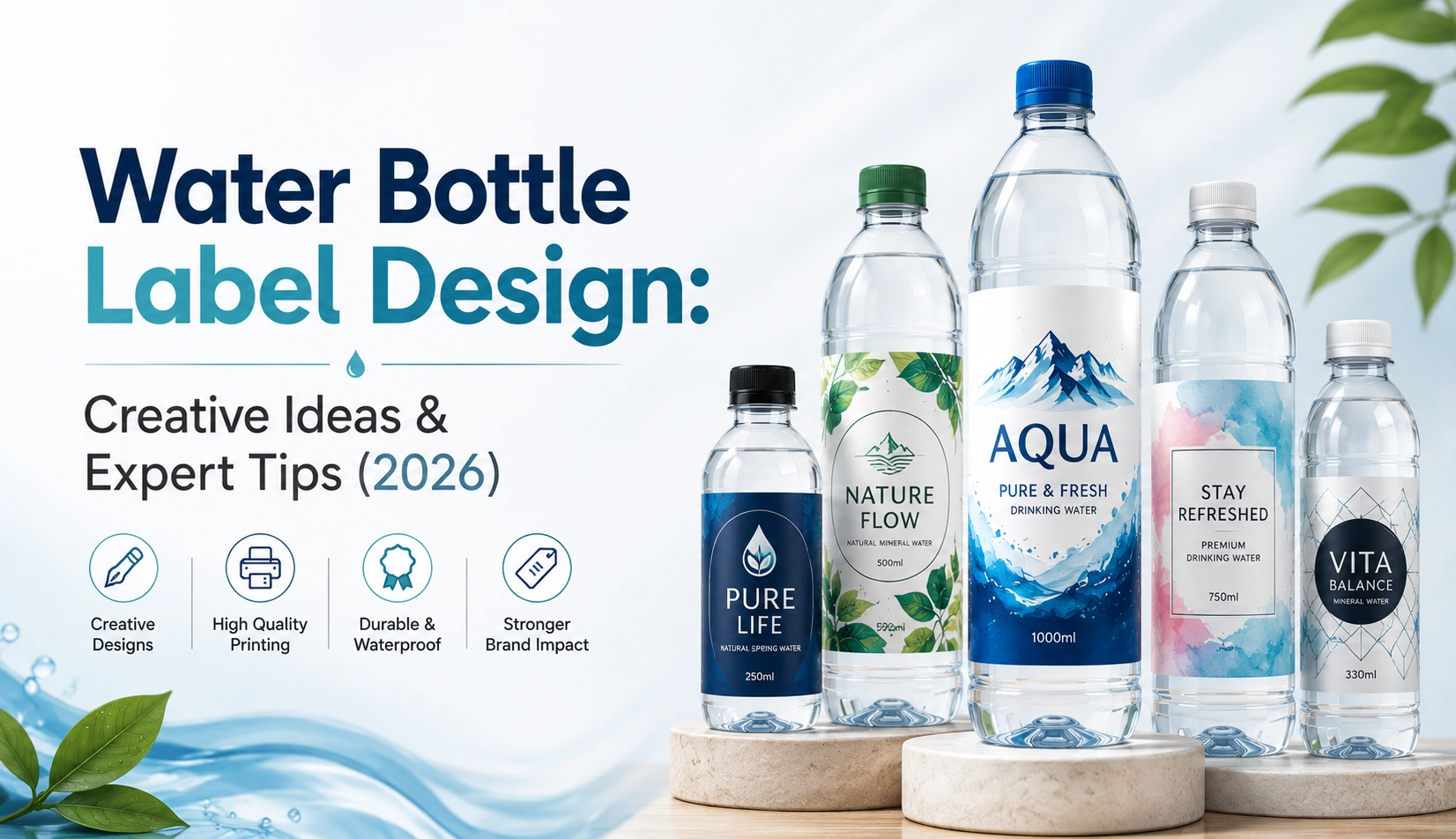
A Complete Guide to Water Bottle Label Design, Covering Creative Ideas, Mineral Water Labeling, and Material Choices That Actually Work
Grab any bottled water at a kirana store counter and look closely. Chances are it’s the exact same water, more or less, as three other bottles sitting right next to it. Same clarity, same taste, same 500ml or 1 litre format. So why does one brand sell out and another sits there for weeks?
The label is doing that work. All of it, basically, since there’s nothing else on the bottle to argue with a shopper. Water bottle label design carries a strange amount of pressure for something wrapped around a product that has no smell, no color, and no flavor to lean on.
This piece walks through how that pressure actually gets handled well, from everyday purified water to mineral water lines charging three times the price for what looks, chemically, like the same liquid.
Quick Insight: Pick up your own bottle right now and turn it in your hand. Notice where the label wraps, where it overlaps, where the seam sits. That seam is where a lot of designs quietly fall apart.
Water Doesn’t Sell Itself, the Label Does
There’s a reason water bottle labels get treated as their own design specialty rather than a subset of general food and beverage labeling. The product gives you almost nothing to work with visually. No fruit to photograph. No steam rising off anything. Just clear liquid in a clear or lightly tinted container.
That blank canvas cuts both ways. It forces real creative discipline, since there’s no shortcut through good photography or bold ingredient callouts. Everything rides on typography, color choice, and a handful of visual cues shoppers have learned to associate with clean, trustworthy water over years of exposure to the category.
Most water labels end up carrying a fairly predictable set of information, even if the visual treatment varies wildly between brands:
- Brand name and logo, almost always given the most visual weight on the label
- Source type, purified, mineral, spring, alkaline, whatever applies
- Volume and, where relevant, mineral or nutritional content
- Certification and compliance details, BIS marking is standard in India
- Barcode
- A visual language built around purity, water drops, mountain lines, cool color tones
Snapshot: a water label isn’t selling a taste. It’s selling an idea of cleanliness and trust, and it has to do that almost instantly.
Reading the Bottle Before You Design the Label
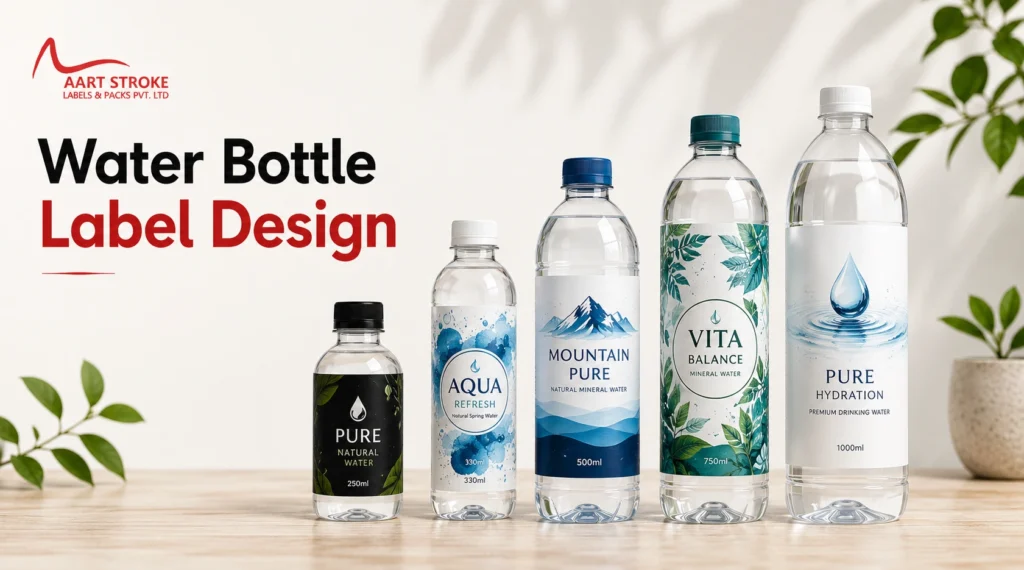
Before opening a design tool, it helps to actually understand why water label design behaves so differently from other categories. Since the buying decision happens fast, often on autopilot, the label’s job is recognition and reassurance more than persuasion in the traditional sense.
A shopper grabbing water at a train platform isn’t comparing ingredient panels. They’re pattern matching against brands they already trust, or picking whatever looks cleanest and most professional in a two-second glance. That’s a very different psychological moment than someone reading the back of a skincare bottle.
This changes what “good design” even means here. A messy or amateur-looking water label doesn’t just look unpolished, it actually raises quiet doubts about whether the water itself is safe. That association is stronger in this category than almost any other packaged good.
What this actually affects on the ground:
- Whether a shopper trusts the water enough to drink it without a second thought
- How the bottle performs sitting next to five near-identical competitors
- Whether distributors and retailers accept the label without flagging compliance gaps
- Repeat purchases, since water is often bought out of habit rather than deliberation
- How the brand can eventually justify a premium price point, if that’s the goal
Reader Note: it’s tempting to underinvest here because “it’s just water.” In a category this crowded, that’s backwards. The label often is the entire brand strategy.
Where the Design Actually Happens: Color, Shape, Material
Three things do most of the heavy lifting on a water label: color choice, how the label handles the bottle’s curve, and the material it’s printed on. Get these three right and most of the rest falls into place.
Color leans predictably toward blue and white across the category, tied to associations most people don’t even consciously register anymore. That said, a growing number of premium and mineral brands intentionally break from this, using black, silver, or deep green to separate themselves and signal a different price tier entirely.
Shape and wrap matter more here than in almost any other label category, purely because bottles are cylindrical and labels are flat when designed. A logo that sits centered and balanced on a screen can end up distorted or partially hidden once it wraps around a curved surface, especially near the seam where the label overlaps itself.
A short list worth running through before finalizing anything:
- Check how the design behaves once wrapped around the actual bottle curve, not a flat mockup
- Keep important text and logos away from the label’s outer edges
- Pick a material that won’t peel once the bottle sweats with condensation
- Run a wet and cold test before locking in any material choice
- Make sure certification text stays legible, not just present
Quick Insight: get a blank sample bottle from your manufacturer and physically wrap a printed test label around it. A flat digital proof will lie to you almost every time about how a logo actually reads once curved.
Six Creative Directions for Water Bottle Labels
Creative water bottle label design rarely means adding more. Usually it means picking one strong idea and having the discipline to leave the rest of the label alone.
The stripped-back approach. One color, thin confident type, generous white space. Works well for purified or alkaline water aimed at a health-conscious buyer who associates simplicity with honesty.
The landscape story. Mountain silhouettes, watercolor washes, muted greens and blues. This suits spring water brands where the actual sourcing location is part of what’s being sold, not just the water itself.
The sport and energy angle. Sharp geometric shapes, bold color blocking, sometimes a matte bottle finish with metallic foil lettering. Common among fitness-oriented water brands trying to escape the traditional blue-and-white look entirely.
The illustrated identity. Custom artwork, regional patterns, or abstract line work used to build a distinct visual identity in a category that otherwise looks nearly identical shelf to shelf.
The near-invisible label. A clear film with just a small logo and required text block, letting the bottle shape and the water itself become the visual focus. Popular with premium glass bottle water brands.
The heritage mark. Vintage-inspired typography, a badge-style logo, sometimes aged paper textures. This works for brands building a story around long-standing sourcing history or family-run operations.
A short gut-check for any creative direction:
- One concept, not five ideas fighting each other on the same label
- Still readable and recognizable at a small, shelf-distance size
- Holds up once printed on the actual chosen material, not just on screen
- At least one visual anchor, logo, color, or shape, stays consistent if more SKUs get added later
Related reading: Clear Label Manufacturer covers material options built specifically for the near-invisible, minimal label style mentioned above.
Mineral Water: A Different Kind of Label Job
Mineral water bottle label design has to do a job regular purified water labels don’t. It has to justify a higher price, usually two to three times more, while also carrying more required information than a standard water label.
Mineral content, source location, and sometimes pH balance typically need to appear directly on the label, and in a lot of markets that’s a regulatory requirement rather than just a marketing choice. That informational density has to be handled without the label starting to feel cluttered or clinical in the wrong way.
Design treatment for mineral water tends to shift accordingly. More refined finishes show up here, embossing, metallic foil, textured stock, all working to reinforce a premium feel that a plain purified water label usually doesn’t need. Color also tends to darken, deep blues, silvers, occasionally black, to visually separate itself from everyday water on the same shelf.
Elements that usually need particular attention on a mineral water label:
- A clear mineral content breakdown, calcium, magnesium, sodium, and so on
- Named source location, since specificity often reads as more credible
- pH level, where the brand’s positioning leans on that detail
- Certification marks specific to mineral water regulations in the target market
- A finish and material that visually earns the higher shelf price
Snapshot: mineral water labels carry more information than standard water labels, but somehow still need to look less busy. That balance is the entire design challenge in this sub-category.
Picking the Right Material for the Job
| Material/Format | Best For | Watch Out For |
| BOPP shrink sleeve | Full bottle wraps on curved shapes | Needs careful print alignment across the seam |
| Coated paper label | Budget still water, ambient storage | Peels or bubbles quickly if refrigerated |
| Clear synthetic film | Minimal, premium visual style | Needs strong contrast since there’s no white backing |
| Waterproof laminate | Sports water, refrigerated stock | Higher per-unit cost, but holds up in wet conditions |
| Foil-accented stock | Mineral and premium water lines | Adds cost, though it lifts perceived value noticeably |
And a second comparison that comes up constantly with newer water brands deciding how to approach the whole project:
| Approach | Ready-Made Template | Fully Custom Design |
| Starting cost | Lower | Higher, but stronger long-term value |
| Shelf differentiation | Often shared with other small brands | Built around a single brand’s story |
| Best fit | Local or regional brands still testing demand | Brands planning wider or export distribution |
Where Water Brands Usually Trip Up
A surprising number of established water brands still get some of this wrong, not just first-timers.
- Choosing a non-waterproof material for a bottle that’s going to sit in a fridge or an ice box
- Designing flat and only discovering the wrap distortion after the print run is already done
- Overloading a naturally minimal category with too much text or competing imagery
- Placing BIS or other certification marks somewhere barely legible
- Leaning so hard on the standard blue-droplet look that the bottle disappears into the shelf
- Chasing a font trend that will look dated well before the product’s shelf life ends
| Mistake | What Works Better |
| Designing without a curved mockup | Wrap-test on a real bottle before finalizing |
| Skipping waterproof stock for cold storage | Default to laminated or synthetic material for anything refrigerated |
| Mixing mineral data and brand copy together | Keep functional information visually separate from marketing language |
| Burying certification marks | Confirm placement rules before the final print file is locked |
Reader Note: printing a large batch before testing how the label handles being wet, cold, and roughly handled is one of the more expensive mistakes in this category, since that’s exactly the condition most water bottles actually live in.
A Simple Process for Getting This Right
Start by being honest about what kind of water is actually in the bottle, purified, mineral, spring, alkaline, since that single decision shapes almost every choice that follows.
- Nail down the water type and the price tier you’re actually competing in
- Study 5 to 8 competitor labels within that specific tier, not the whole aisle
- Choose material based on real storage and selling conditions, fridge, vending machine, ambient shelf
- Decide between template and custom design based on how far distribution is expected to reach
- Sketch two or three visual directions before picking one
- Wrap-test the label on an actual bottle, never just a flat screen mockup
- Get a physical proof tested wet and dry before committing to full production
Snapshot: everything here starts from positioning, not from picking colors first. The visual direction should be a consequence of what the water actually is, not the other way around.
Habits Worth Building Into Your Design Workflow
- Keep the brand mark simple enough to recognize even through condensation on the bottle
- Stay within two or three colors for a confident, uncluttered look
- Treat waterproof or laminated material as the default, not a nice-to-have
- Leave real breathing room, restraint reads as quality in this category more than almost any other
- Always wrap-test before locking in final artwork
- Keep certification and compliance text legible and unmistakable, never styled decoratively
Quick Insight: check the final label under three different lighting setups, bright supermarket lighting, a dim neighborhood shop shelf, and outdoor daylight. Water bottles get sold in all three, and color shifts more than most people expect between them.
A short list worth keeping close before sending anything to print:
- Brand mark reads clearly at a glance
- Certification marks are legible and correctly placed
- Material has been confirmed as waterproof or properly laminated
- Design has actually been wrap-tested on a real bottle
- Colors have been checked under more than one lighting condition
- Mineral or source details are accurate and unambiguous
Is It Worth Hiring a Professional for “Just Water”?
It’s an easy category to underestimate, precisely because the product itself feels simple. That simplicity is exactly why small design mistakes stand out so clearly here, there’s nowhere to hide a bad decision behind busy packaging.
A designer who’s worked on bottled water specifically understands the wrap distortion problem before it happens, not after a print run is wasted. They also tend to already know current certification formatting requirements, which shift more often than most brand owners realize.
There’s a scaling angle too. Professionally built water labels tend to connect naturally into broader work like FMCG label manufacturing and waterproof label production, giving a growing water brand a design system rather than a single one-off label.
What that typically buys a water brand:
- Far fewer reprints caused by wrap or material mistakes
- Real differentiation in a category built on sameness
- Certification and compliance handled correctly the first time
- A design system that extends cleanly across new bottle sizes or SKUs later
Snapshot: in a category this visually repetitive, professional design isn’t really optional. It’s often the single biggest lever a small water brand has to avoid disappearing on the shelf.
Wrapping Up
Water bottle label design looks like the easiest category to work in, right up until you actually try it. With no flavor, color, or texture to lean on, the label ends up carrying nearly the entire weight of trust, brand recognition, and shelf standout by itself.
Whether the goal is a budget purified water line or a premium mineral water brand charging three times as much, the same fundamentals hold. Clear positioning first, material that survives real-world handling, and a design that still looks right once it’s wrapped around a wet, curved bottle sitting in a crowded fridge.
Getting professional water bottle label design right from the start builds trust faster, avoids expensive reprints from wrap or material mistakes, and gives a water brand real room to grow from a single regional shelf to a much wider market.
Reader Questions, Answered
Water offers almost nothing visually distinct, no color, texture, or flavor to draw on. That forces the label to carry nearly all the trust-building and differentiation work, which is why color psychology, typography, and purity-related imagery matter so much more here than in most other categories.
Blue and white dominate the category because of long-standing associations with cleanliness. That said, premium and mineral brands increasingly reach for black, silver, or gold accents specifically to break from that pattern and signal a higher price point on the same shelf.
Mineral water usually needs to disclose specific mineral content, source location, and sometimes pH level, on top of the standard compliance details required for any packaged water. Regular purified water labels tend to carry lighter informational requirements by comparison.
It depends heavily on storage conditions. Anything refrigerated or sold from a vending machine needs waterproof or laminated stock to avoid peeling. Budget water sold at room temperature can sometimes get away with standard coated paper instead.
Real competitor research within the specific price tier helps more than most people expect. An unexpected color choice, a confident and simple brand mark, or a distinctive material finish like matte black or foil tends to separate a bottle from the usual blue-and-white crowd.
Templates work fine for small, local brands still testing whether the product has demand. Once distribution starts expanding, or the brand is aiming for a premium position, custom design tends to pay off through stronger differentiation and a system that scales properly.
In most markets, yes, including BIS certification and batch details commonly required in India for packaged water. Exact requirements shift depending on whether the product is purified, mineral, or spring water, so it’s worth confirming current rules for the specific category.
Yes, quite directly. Retailers and distributors often reject labels that look inconsistent, poorly printed, or missing required certification marks. A clean, compliant label improves the odds of good shelf placement and builds confidence with distribution partners handling the product.
Designing entirely flat on a screen without ever testing how the label wraps around a real, curved, condensation-covered bottle. What looks perfectly balanced in a digital file can distort or become unreadable once it’s actually applied to the product.
Largely yes, with some adjustment. Keeping the core brand mark, palette, and layout consistent across sizes helps with recognition, though proportions usually need small tweaks so the design doesn’t end up looking stretched or cramped on smaller or larger bottles.