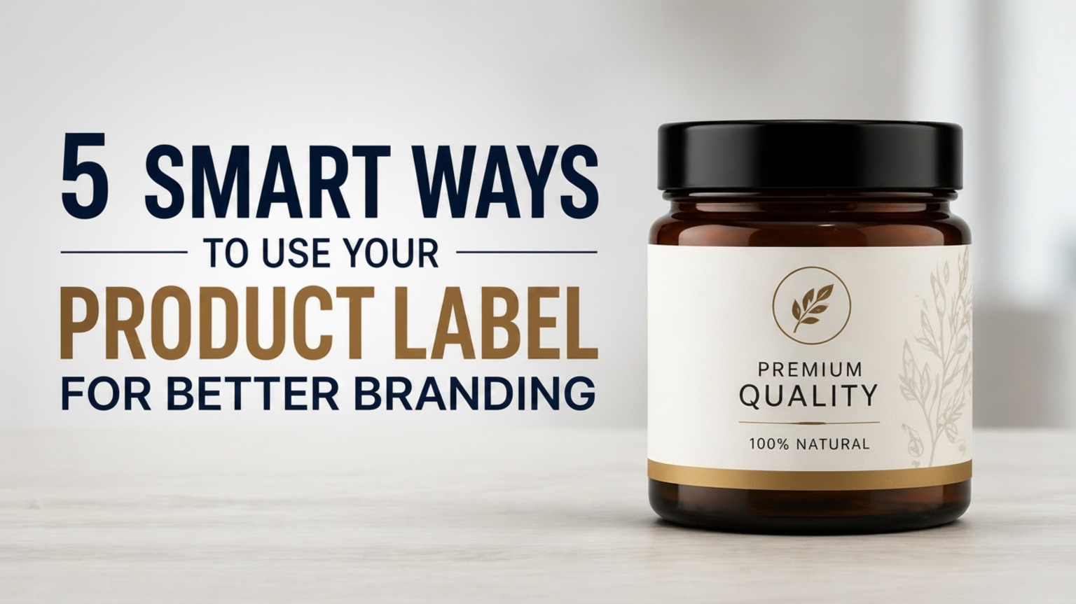
5 Smart Ways to Use Your Product Label for Better Branding
Your Product Label Is Doing More Than You Think
Most business owners think of a product label as a necessity — something that tells the customer what’s inside the package, lists the ingredients, and carries the brand name.
That thinking is leaving serious money on the table.
Your label isn’t just a sticker. It’s a salesperson that works 24 hours a day. It’s the first conversation your brand has with a potential customer. It’s the thing someone photographs and shares on Instagram. It’s what a shopper reads while deciding whether to buy your product or the one next to it. The brands that understand this — really understand it — use their labels strategically. They think beyond compliance and basic information. They treat every square centimetre of label space as an opportunity to communicate, connect, and convert.
At Aart Stroke, we’ve helped brands across industries rethink their approach to labels, and the results speak for themselves. In this post, we’ll walk you through five smart, actionable ways to use your product label to build a stronger brand, create loyal customers, and stand out in a crowded market.
Why Branding Through Your Product Label Matters
Before we get into the five strategies, let’s take a moment to understand why your label plays such a critical role in branding.
The Shelf Is a Battleground
Whether you sell in a physical store or online, your product competes for attention every single moment. On a retail shelf, a customer walks past dozens of products in seconds. Online, they scroll through rows of thumbnail images. In both cases, your label is the first — and sometimes only — thing that makes them stop.
A well-branded label creates what marketers call a “pattern interrupt.” It breaks through visual noise and earns attention.
Labels Create Emotional Connections
Colors trigger feelings. Typography communicates personality. Imagery tells stories. When a label is designed thoughtfully, it doesn’t just inform — it makes the customer feel something. And buying decisions are emotional far more often than they are logical.
Consistency Builds Recognition
Every time a customer sees your label — on a shelf, in a friend’s home, in a social media photo — it’s a brand impression. The more consistent and distinctive your label is, the faster people learn to recognise and trust your brand. According to Nielsen’s research on consumer trust, familiarity is one of the top drivers of purchase decisions. Labels that look consistent and professional accelerate that familiarity.
Now, let’s get into the five smart ways to put this into practice.
1. Tell Your Brand Story Directly on the Label
Stop Wasting Your Label’s Most Powerful Real Estate
Most labels use their space for nothing more than the product name and a logo. But your label has room — and opportunity — to say something meaningful about who you are and why your product exists. Customers today don’t just buy products. They buy stories, values, and identities. A label that tells a real, relatable story creates an emotional connection that a generic label simply cannot.
How to Do It Effectively
You don’t need a novel. A single well-written sentence or short paragraph on the back or side of your label can do the job.
Think about what makes your brand worth caring about:
- Was it born from a personal problem you solved?
- Is it made using a traditional family recipe or technique?
- Is it sourced ethically or produced sustainably?
- Does a portion of your revenue support a cause?
Tips From Aart Stroke
- Keep the story short — two to four lines maximum
- Write in a warm, human tone — not corporate language
- Place it where eyes naturally go: the back panel or the side face
- Make the font readable — at least 8pt, preferably larger
2. Use Design Elements Strategically to Signal Quality and Personality
Design Is Not Decoration — It’s Communication
Every visual element on your product label sends a message. Customers receive these messages instantly, often without conscious awareness. The wrong design signals cheap, untrustworthy, or confusing. The right design signals premium, reliable, and worth buying.
Color Psychology on Labels
Colors are one of the most powerful tools in label design. Here’s a quick guide:
Choose colors that match what your customer expects to feel when using your product — not just what you personally like.
Typography Tells a Story Too
The Power of White Space
Resist the urge to fill every inch of your label. White space — empty areas with no text or graphics — actually increases perceived quality. It gives the eye room to breathe and makes your label feel more considered and premium.
3. Add Interactive Elements to Connect the Physical With the Digital
Your Label Can Be a Digital Gateway
One of the most underused opportunities in modern product label design is the bridge between physical and digital. Your label sits in a customer’s hands — and that customer almost certainly has a smartphone nearby. That proximity is an opportunity.
QR Codes That Actually Add Value
QR codes on labels have been around for a while, but many brands use them poorly — linking to a generic homepage that adds no value. Done right, a QR code can:
- Link to a product tutorial or recipe video
- Direct customers to a loyalty or rewards programme sign-up
- Showcase behind-the-scenes content about how the product is made
- Offer an exclusive discount for label scanners
- Connect to a detailed ingredient or sourcing transparency page
The key is to make the destination genuinely worth visiting. If someone scans your code and lands on a page that’s slow, generic, or unhelpful, you’ve wasted the opportunity and damaged trust.
Social Media Handles and Hashtags
Include your Instagram, Facebook, or Pinterest handle on the label. If your product is visually appealing and has a good label design, customers will photograph it and potentially share it. A visible handle makes it easy for them to tag you. You can also create a product-specific hashtag and print it on the label to encourage user-generated content. This is essentially free marketing driven by your existing customers.
Augmented Reality (AR) — The Next Frontier
Some forward-thinking brands are now embedding AR triggers into their labels. A customer points their phone camera at the label and sees an animated brand story, a 3D product demo, or an interactive experience. This is more complex and costly to set up. Still, for brands in premium categories — wine, spirits, beauty, and gourmet food — it creates a memorable, shareable experience that sets you apart completely.
4. Build Trust With Certifications, Badges, and Transparency
Trust Is a Purchase Driver
In today’s market, skepticism is high. Customers have been misled by greenwashing, vague claims, and misleading packaging. The brands that win are the ones that prove their claims with visible, credible evidence right on the label.
Certifications That Signal Credibility
Depending on your product category, relevant certifications can significantly increase purchase confidence:
- FSSAI licence number — essential for food products sold in India; builds legal credibility
- ISO certification — signals quality management standards
- Organic certification — from NPOP or other recognised bodies for food and cosmetic products
- Cruelty-free or vegan logos — increasingly important for cosmetics and personal care
- Non-GMO verified — relevant for food brands targeting health-conscious consumers
- Halal or Kosher certification — important for brands targeting specific religious communities
Each of these badges does one powerful thing: it takes a claim you make about your product and backs it with third-party verification. That’s far more convincing than simply printing “natural” or “safe” on the label.
Ingredient Transparency
Clean label trends — where brands list every ingredient clearly and avoid mysterious chemicals or additives — are growing rapidly. Brands that embrace full transparency on their product label tend to build stronger loyalty, especially among health-conscious buyers. If your product has genuinely good ingredients, show them off. Don’t bury them in fine print. Make your ingredient list readable, and consider adding a short “why we use this” explanation for key ingredients if space allows.
Honest Quantity and Weight Information
This sounds basic, but many brands understate or obscure net weight, volume, or serving size information. Customers notice this, and it breeds distrust. Clear, honest, prominently placed quantity information signals that your brand has nothing to hide.
5. Create Label Variations for Seasons, Editions, and Campaigns
Variety Keeps Your Brand Fresh and Drives Repeat Purchases
One of the smartest and most underused branding strategies available to product businesses is the limited-edition or seasonal label. Changing your label design for a specific time, event, or campaign creates excitement, urgency, and a reason for existing customers to re-engage with your brand.
Why Limited-Edition Labels Work
- They create a collectability factor — customers buy because they don’t want to miss out
- They give you fresh content for social media without changing the product itself
- They signal that your brand is active, evolving, and paying attention
- They can target specific occasions — festivals, gifting seasons, regional events
Seasonal Label Ideas for Indian Brands
How to Execute This Without Overspending
The beauty of custom adhesive labels is that you don’t need to change your packaging at all. Simply design a new label, print a short run, and apply it over your standard packaging for the campaign period. This keeps costs low while delivering a high-impact result.
At Aart Stroke, we recommend planning two to three seasonal label moments per year at a minimum. Space them out, make each one feel distinct, and communicate the limited nature clearly — either on the label itself or through your marketing channels. For more practical ideas on making your packaging work harder for your brand, visit the Aart Stroke blog on product packaging strategy, packed with guides designed for real businesses at every stage.
Bonus Tip: Consistency Across Your Entire Product Range
This isn’t one of the five main strategies, but it underpins all of them.
No matter how good each label is, if your product range looks like it was designed by five different people on five different days, your branding suffers.
Consistency means:
- The same color palette across all products
- The same logo placement and sizing
- The same font family throughout
- A shared visual language that ties all products together
Common Mistakes Brands Make With Their Product Labels
Even well-intentioned brands fall into these traps:
- Trying to say too much — cramming every claim and feature onto the label creates visual chaos. Prioritise ruthlessly.
- Using fonts that are too small — if someone has to strain to read your label, they won’t.
- Ignoring the back and side panels — these are valuable branding spaces that most brands treat as an afterthought.
- Updating the product but forgetting the label — if your formula, ingredients, or certifications change, your label must reflect it.
- Choosing design trends over brand identity — a trendy label today can look dated in two years. Build for longevity.
- Not testing the label on the actual product — a design that looks great on screen can look completely different on a curved bottle or matte surface. Always test before printing at scale.
Conclusion: Your Label Is Your Brand’s Loudest Voice
In a market full of options, your product label is often the deciding factor between a sale and a missed opportunity. It’s small in size but enormous in impact. The five strategies we’ve covered — telling your brand story, using design with intention, adding interactive digital elements, building trust through transparency, and creating seasonal label moments — are all practical, achievable, and proven to work. Even one thoughtful change — a better story on the back panel, a QR code that leads somewhere genuinely useful, a seasonal design for the next festival — can shift how customers perceive your brand.
Ready to take your product label strategy to the next level? Visit Aart Stroke for expert insights, design guides, and practical tools to help your brand stand out — on the shelf, online, and everywhere in between.
Frequently Asked Questions
Q1: How much information should I put on a product label?
Ans. Focus on what the customer needs to make a decision and what the law requires. Beyond that, every element should either build trust, tell your story, or guide the next action. When in doubt, less is more. White space increases perceived quality.
Q2: Can a small business with a limited budget still create a great label?
Ans. Absolutely. Tools like Canva, Adobe Express, and free design templates make it possible to create professional-looking labels on a budget. What matters is thoughtful design, colors, typography, and layout, not expensive printing. Start simple and upgrade as you go.
Q3: How often should I update my product label design?
Ans. Avoid changing your core brand identity too often; consistency is essential for identity. However, introducing seasonal or limited-edition variations two to three times a year keeps things fresh without confusing customers.
Q4: Should I hire a professional designer for my labels?
Ans. If budget permits, especially for your core label, which will represent the brand for a long time. A professional designer knows print specifications, color profiles, and visual hierarchy that DIY tools can’t fully replace. Think of it as an investment, not a cost.
Q5: What’s the most important branding element on a product label?
Ans. Your logo and color palette are the most instantly recognizable. But overall, how all the elements work together ultimately creates brand identity. No single element works in isolation.