
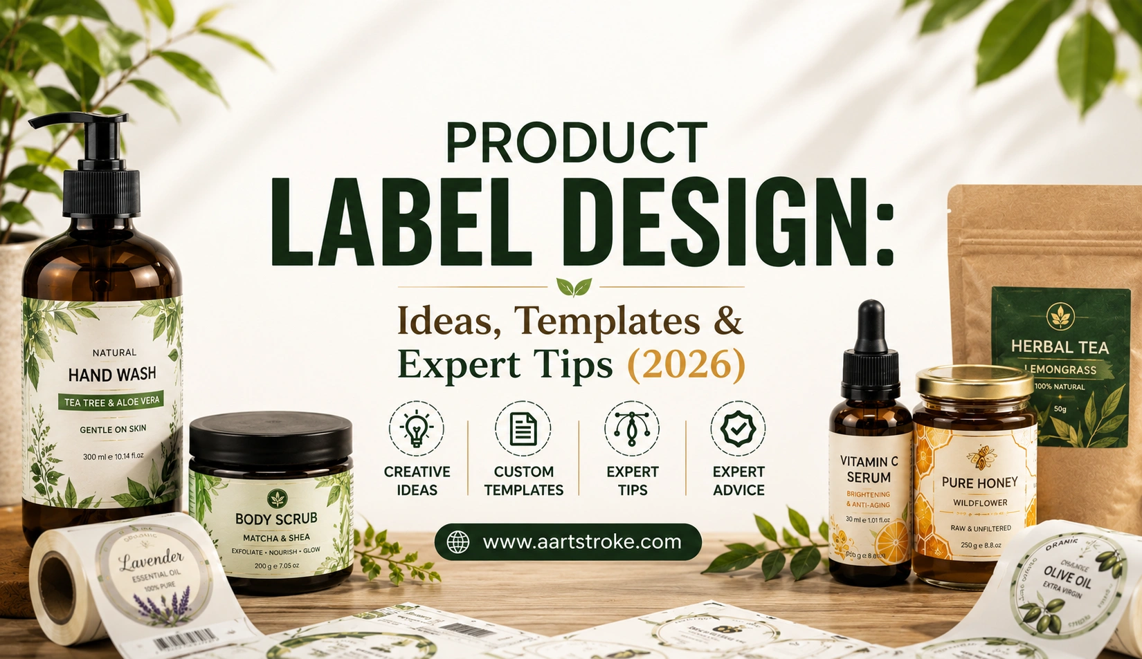
You’ve done this yourself. Two products, almost identical, sitting next to each other on a shelf. You pick one. Why? Nine times out of ten, it comes down to the label. That little rectangle of printed material is doing more work than most brands give it credit for.
Product label design is the part of packaging that gets rushed at the end, honestly. A logo goes here, ingredients go there, done. But it’s usually the first physical thing a customer touches before anything else about your brand even registers.
Here’s the thing though. A label isn’t just there to look nice. In about three seconds, it has to tell someone whether your product is worth trusting. Packaging researchers have tracked this with eye-tracking studies for years now, and the number that keeps showing up is somewhere around two to three seconds of shelf attention before a shopper moves on or picks something up.
This guide walks through what actually makes label design work, where brands mess it up (a lot, honestly), and how to pick the right approach depending on what you’re selling. Food, cosmetics, supplements, doesn’t matter. The logic shifts a bit by category but the core problems repeat.
Expert Tip: Go stand in front of your actual shelf. Or a competitor’s, if yours isn’t live yet. Look at what’s already sitting there. Your label has to win that specific fight, not look good floating alone on a laptop screen at 200% zoom.
What Is Product Label Design, Really?
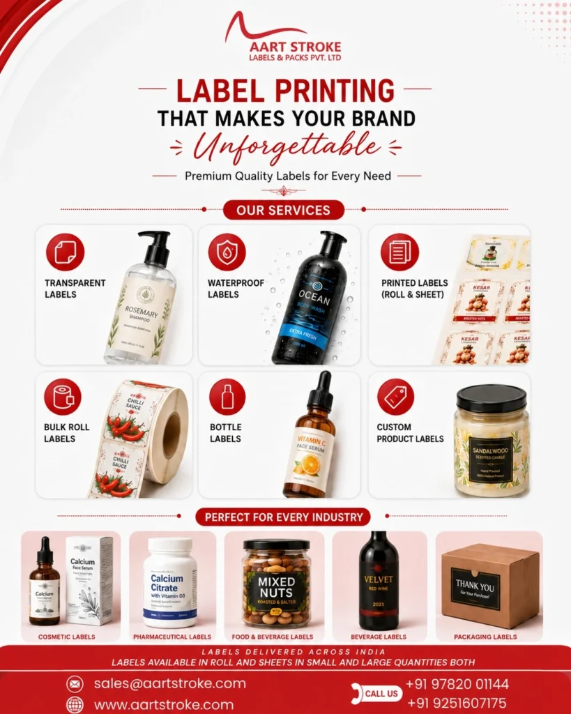
Short answer: it’s the visual and informational layer on a product’s packaging. Layout, typography, color, imagery, plus whatever regulatory text your category requires. That’s the technical definition. In practice it’s part branding, part marketing psychology, part print production knowledge, all crammed into one small printed surface.
It’s not decoration stuck onto a bottle. A label is doing several jobs at once, and if it drops even one of them, the whole thing underperforms even if it’s gorgeous to look at. It has to identify the brand. Communicate what’s actually inside. Satisfy legal requirements. And, somewhere in there, convince a stranger to buy it.
Labels also behave differently depending on the surface they’re printed on. A wine bottle label isn’t playing the same game as a shrink sleeve wrapped around a beverage can. And neither of those match a flat panel printed directly onto a food carton.
What usually shows up on a label:
- Brand name and logo, positioned deliberately, not just centered by default
- Product name plus variant or flavor info
- Ingredients, nutrition facts, or technical specs
- Compliance text (net weight, warnings, certifications)
- Barcode or QR code
- Whatever visual branding ties it back to the rest of your packaging
Quick summary: label design mixes legal obligation with persuasion. It’s functional first, decorative second. And no two product categories need the exact same format.
Why Bother Getting Product Label Design Right?
Think about where your label actually does its job. Usually it’s the only piece of marketing a customer sees at the actual moment of purchase. No salesperson standing there. No ad running in the background. Just the shelf, and maybe two or three seconds of someone’s attention.
That’s a lot riding on a small piece of printed material. A weak label just fades into the shelf. Or worse, it makes a genuinely solid product look cheap, which is honestly one of the more frustrating things that happens to good brands.
There’s a repeat-purchase side of this people forget about too. A well-designed label makes your product easy to spot again next time someone’s shopping. That recognition is what turns a one-off buyer into someone who grabs your product automatically, without thinking twice.
What good label design actually affects:
- First impression and how premium (or cheap) the product feels
- Whether people remember and rebuy it
- Legal safety, since compliance issues can pull a product off shelves
- Retailer approval, because plenty of retailers reject labels that don’t meet format specs
- Online conversion, since e-commerce shoppers zoom into label photos before buying
Common mistake: treating the label like an afterthought, something you slap on once the product itself is done. It should start alongside product development. Not after.
Essential Elements of a Great Product Label Design
Five things matter most here: typography, color, information hierarchy, material and finish, and compliance. Skip one and the label limps along, no matter how strong the rest of it is.
“Make it look nice” isn’t really advice. People who do this for a living, day in day out, think in specifics. Not vibes.
Typography has to stay legible at small sizes, often read from a couple feet away on a shelf. A decorative font that looks gorgeous blown up on your screen can turn into visual mush once it’s printed two inches wide. That’s a real problem, and it happens constantly with first-time brands.
Color should fit the category while still standing apart from whoever’s sitting next to you on the shelf. Earthy, muted tones for organic food. Bold, high-contrast for energy drinks. Soft pastels for baby products. That’s the general logic, but copying it exactly just makes you blend in with everyone else doing the same thing.
Hierarchy decides what gets read first, second, third. Brand name usually leads. Then product type. Then the smaller stuff, flavor, size, whatever.
A quick checklist worth running through:
- Type that’s legible at real print size, not screen size
- A palette tied to your brand and category psychology
- Clear order: brand, then product, then details
- Material that actually fits the product (glossy, matte, kraft, foil)
- Compliance text placed where it’s readable, not crammed in a corner
- Alignment with the rest of your packaging system
Expert Tip: Print a mock label at true size. Tape it onto the real product. Do this before you finalize anything. Screens lie about scale more often than people expect, and this one habit catches a surprising number of mistakes early.
Product Label Sticker Design: What’s Actually Different?
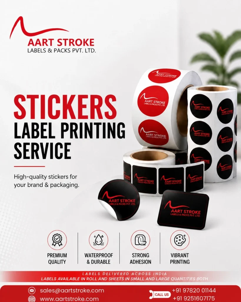
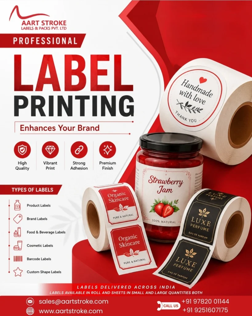
Sticker labels are self-adhesive, applied after the product’s already made. That’s the whole distinction, really, versus labels printed directly onto the container itself. They’re more flexible for short runs, or when you’re constantly tweaking variants.
Most of the general design principles carry over. But stickers bring their own quirks. Die-cut shape matters. Adhesive type matters, especially if the product gets refrigerated or handled a lot. Moisture resistance too.
You’ll see sticker labels everywhere in small-batch products, candles, soap bars, skincare lines just getting started. Mainly because they’re cheaper to produce in small quantities than direct container printing, which needs bigger minimum runs to make financial sense.
| Factor | Sticker Labels | Direct Print Labels |
| Best for | Small to mid batch runs | Large volume production |
| Flexibility | Easy to update per batch | Costly to change once locked in |
| Cost per unit (small runs) | Lower | Higher |
| Application | Applied after production | Built into the manufacturing process |
| Shape options | Highly customizable die-cuts | Limited by container mold |
Businesses juggling multiple product variants often end up needing broader custom sticker design support across their whole packaging line, not just for the main label.
Quick checklist for sticker labels:
- Confirm the adhesive actually matches your surface (glass, plastic, metal all behave differently)
- Test water and fridge exposure if that’s relevant to your product
- Pick a die-cut shape that suits your container’s curve
- Check how the ink holds up to handling and smudging
Product Label Design Templates vs Custom Designs
Templates get you moving fast and cheap. Custom design gets you something nobody else on the shelf has. Which one’s right depends mostly on budget, timeline, and how crowded your category already is.
Templates aren’t a bad idea, to be clear. If you’re testing a new product’s market fit, a well-picked template, edited thoughtfully, can genuinely work for a while. The problem shows up when a dozen other small brands grabbed the exact same template from the exact same marketplace.
Custom work costs more up front. That said, it usually pays for itself through stronger differentiation and a design built to fit your brand instead of the other way around. Nothing gets forced into a layout that wasn’t made for it.
| Aspect | Templates | Custom Design |
| Upfront cost | Low | Moderate to high |
| Uniqueness | Limited, often reused elsewhere | High, built for your brand specifically |
| Turnaround | Fast | Longer, more revision rounds |
| Brand fit | Generic | Tailored |
| Scalability | Harder across multiple SKUs | Built to expand with new products |
| Best for | Early-stage testing | Brands ready to scale |
Quick summary: templates are fine for speed and low-risk testing. Custom design wins long term. Most growing brands outgrow their template within a year, sometimes less.
Creative Product Label Design Ideas by Industry
No single formula works across every category. What kills it for a hot sauce brand will look completely off on a skincare serum. Here’s how the thinking shifts.
Food Labels
Food labels need to make people hungry, basically, while staying transparent about ingredients and easy to scan nutritionally. Warm, natural-looking photography usually beats the overly polished, almost fake-looking stuff most brands default to.
Handwritten fonts, kraft textures, hand-drawn ingredient illustrations, all of that reads well for artisanal or organic brands. Bold color blocking and punchy photography work better for snack brands fighting for shelf visibility in a crowded aisle.
Related reading: Food Label Printing and FMCG Label Manufacturer in Jaipur cover material and compliance specifics for packaged food in more detail.
Beverage Labels
Beverages get refrigerated, sweated on, handled roughly. The label needs to survive all of that without peeling. Bold type and strong contrast tend to win here, since drinks often get grabbed on impulse rather than carefully considered.
Common mistake: picking glossy paper stock for drinks that’ll sit in a fridge. Moisture gets under the coating fast, and you’ll see bubbling within days. A waterproof label manufacturer solves this at the material level, not the design level, and it’s worth getting right before printing thousands of units.
Health and Supplement Labels
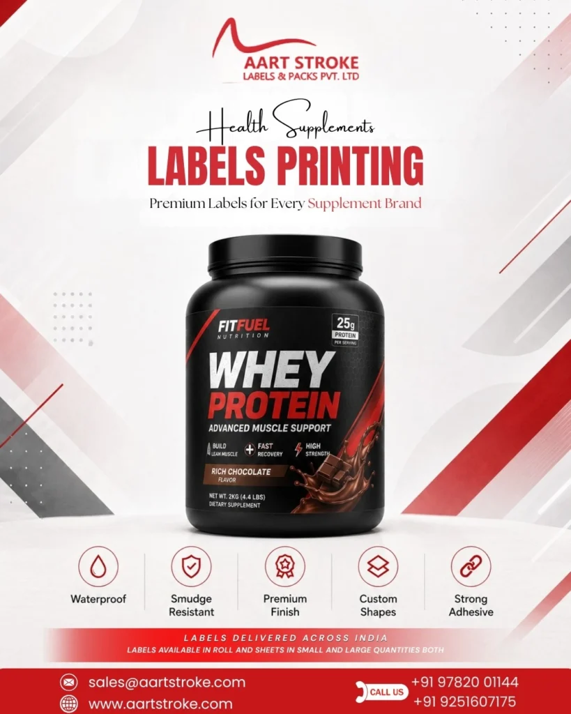
This category faces heavier regulatory scrutiny than most, so the design has to balance persuasion with accuracy. Clean layouts, clear dosage info, visible certification badges, that combination builds trust fast.
Loud, colorful branding can actually backfire here. It reads as less serious. Minimalist, almost clinical design tends to earn more trust in this space. For specifics, check Health Supplements Labels Printing and Ayurvedic Medicine Label Printing.
Fashion Labels
Apparel labels lean on texture. Embossing, foil stamping, and fabric tags instead of plain paper. The label often works as a small brand statement on its own, more than just an info dump.
Electronics Labels
Function beats flair here. Durability, compliance markings, model numbers, safety certs, all of it needs to stay legible for years, sometimes in rough conditions. Clean grid layouts with high contrast text hold up better than anything decorative.
Cosmetic Product Label Design
Cosmetic product label design leans hard on premium finishes, foil, embossing, matte lamination, mostly to signal quality before someone even reads the ingredient list. Ingredient transparency matters a lot too these days, since buyers actually research formulations before they buy.
Cluttered cosmetic labels lose trust fast, especially now that skincare buyers are more ingredient-savvy than they used to be. For manufacturing details, see Cosmetic Label Manufacturers and Perfume Bottle Label Manufacturers.
Checklist across industries:
- Match material and finish to how the product actually gets stored and used
- Look at 3 to 5 direct competitors before locking in a direction
- Never compromise on compliance text, whatever the style
- Test legibility at real shelf distance, not zoomed in on a screen
Common Product Label Design Mistakes
Even brands that have been around a while trip on this. Some mistakes are purely visual. Others are compliance issues serious enough to get a product pulled off shelves entirely.
What tends to go wrong:
- Overcrowded layouts where nothing gets to breathe
- Fonts so small you need a phone flashlight to read them
- Designing on screen without checking how it prints on the actual material
- Copying a competitor’s layout a little too closely
- Missing required info, weight, batch number, certifications
- Inconsistent branding across a product line’s different SKUs
- Chasing a design trend that’ll look dated in two years
| Mistake | Better Practice |
| Cramming every detail onto the front label | Push secondary info to the back or side panel |
| Using low-res logo files | Design from vector source files, always |
| Ignoring print bleed and safe zones | Build to printer specs from day one |
| Skipping a physical print proof | Request one before any full production run |
Common mistake: approving a label purely from a digital mockup, no printed proof, no check under real lighting. Colors shift between screen and print way more than people expect. It’s an easy thing to overlook until you’ve got a few thousand mislabeled units.
How to Choose the Right Product Label Design
Start with your product category, your actual target buyer, and where the thing is actually going to sell. A label built for e-commerce thumbnails needs different priorities than one that has to work from three feet away on a crowded shelf.
A rough process that works:
- Define your target buyer, what they actually care about (price, quality, ingredients, status)
- Audit 5 to 8 competitor labels in your exact category, not adjacent ones
- Pick material and finish based on real handling and storage conditions
- Decide template vs custom based on your budget and growth plans
- Draft two or three directions before committing to one
- Test with real people. Actual target customers, not just friends who’ll say it’s great
- Get a physical print proof before running full production
Quick summary: start from your customer’s actual shopping context, not just what looks nice. Competitor research needs to be specific to your niche. And always check a physical proof before mass printing, no exceptions.
Product Label Design Best Practices
These aren’t hard rules, more like patterns that hold up across most categories, over and over.
- Keep brand name and product type readable from arm’s length
- Cap yourself at two or three fonts max
- Design for shelf and e-commerce thumbnail visibility both
- Leave white space, don’t fill every inch just because you can
- Use high-resolution, print-ready files, 300 DPI minimum
- Keep consistency across your whole product line
- Pick materials that fit how the product’s actually handled in real life
Expert Tip: design at the exact final print size. Not scaled up on a big monitor. Something that looks balanced zoomed to 200% often looks cramped, or oddly empty, at true size. This trips people up constantly.
Quick Label Design Checklist:
Before sending your label to print, run through this:
- Brand name is clearly visible
- Legally required text is included
- Fonts stay legible at actual print size
- Colors have been tested in print, not just on screen
- Material matches how the product is stored
- Barcode or QR code actually scans
- Design stays consistent with the rest of your product line
- Physical proof has been reviewed before full production
Why Professional Product Label Design Delivers Better Results
DIY tools have gotten genuinely better over the past few years, sure. But there’s a ceiling. It shows up fast once a brand starts scaling across multiple SKUs, retailers, and markets at the same time.
A professional designer brings knowledge that’s easy to miss otherwise. Bleed and safe zones. How different inks behave on different materials. Regulatory formatting quirks. What a label actually looks like wrapped around a curved bottle instead of sitting flat on a screen.
There’s also a consistency angle worth mentioning. Professional design ties your label back into your broader brand identity design and product packaging design, instead of treating the label like some isolated task disconnected from everything else you’re building.
What that usually gets you:
- Fewer expensive reprints from material or file mistakes
- Stronger differentiation from whoever’s next to you on the shelf
- Better odds of retailer approval
- A design system that scales as you add products
- Compliance accuracy that keeps you out of legal trouble
Quick summary: professional design cuts down costly production mistakes, scales better as your line grows, and keeps compliance and branding tight across everything you sell.
Conclusion
Product label design isn’t something you bolt on at the end. It’s a working piece of your brand strategy, sitting right at the exact moment someone decides whether to trust your product or walk past it for a competitor’s.
Whether you’re deciding between a template and custom work, figuring out the right material for a cosmetic line, or trying to fix a label that just isn’t converting anymore, the fundamentals stay pretty much the same. Clarity. Compliance. An actual understanding of where and how your product gets bought.
Getting professional product label design right from the start saves money on reprints down the line, builds shelf recognition faster, and gives your brand room to grow into new products without starting from scratch every single time.
Faqs
It’s the process of creating a package’s visual and informational surface, branding, typography, imagery, plus whatever regulatory text applies. It mixes marketing appeal with functional information delivery, so the product stands out while still meeting legal labeling requirements for its category.
Depends heavily on complexity, how many SKUs you’re dealing with, and whether it’s fully custom or a template edit. A single-product label can be fairly affordable. Multi-SKU systems with premium finishes cost more. Best to just request a quote based on your actual product line.
Label design is the printed surface itself, brand and product info. Packaging design covers the whole container, its shape and material. Labels usually live inside a broader packaging system, but they can also get designed on their own for existing packaging.
Yes, and honestly that’s fine for early testing or a tight budget. The catch is templates get reused across a lot of brands, so differentiation suffers. Once your product starts competing on crowded retail shelves, custom design generally performs better.
Most printers want vector files, AI, EPS, or a high-res PDF, usually 300 DPI minimum with bleed and safe zones already built in. A low-res JPEG or a screenshot won’t cut it for actual production runs.
It comes down to how the product’s stored and handled. Refrigerated items need waterproof stock. Oily products need grease-resistant material. Premium cosmetics often go with foil or textured finishes. Get the material wrong and you’ll see peeling or smudging down the line.
Varies by country and category, but usually covers net weight, ingredients, manufacturer details, batch number, relevant certifications. Regulated categories like food, cosmetics, and supplements often add extra country-specific requirements on top, so it’s worth checking current guidance directly.
Anywhere from a few days to a few weeks, depending on revision rounds, SKU count, and overall complexity. Rush options exist for smaller projects, though quality usually improves when there’s enough time for proper research and physical proofing.
Templates make sense early on, when you’re testing an idea and controlling costs. Once the product gains real traction and starts competing directly on crowded shelves, switching to custom design usually pays off in differentiation and long-term brand value.
It leans on premium finishes, foil stamping, embossing, matte lamination, to signal quality fast. Ingredient transparency matters more here too, since beauty buyers increasingly research formulations before they buy, which makes clean, readable ingredient lists a real priority.
Start with real competitor research, not guesswork. Bold, tested color contrast, a clear typography hierarchy, and a genuinely distinct angle separate strong labels from forgettable ones. Testing with actual target customers before finalizing catches problems early too.
Not necessarily separate labels, but priorities shift a bit. E-commerce buyers zoom into photos, so fine detail and readability matter more there. Retail shelf labels need to work from a few feet away, so bold hierarchy and contrast carry more weight in that context.
Also Read:
- Types of Label Materials: Which One Should You Choose?
- Label Design Ideas: 30+ Creative Examples for Every Product
- Water Bottle Label Design: Creative Ideas & Expert Tips (2026)
- Everything You Need to Know About Product Label Design
- How Embossed Labels Enhance Product Packaging